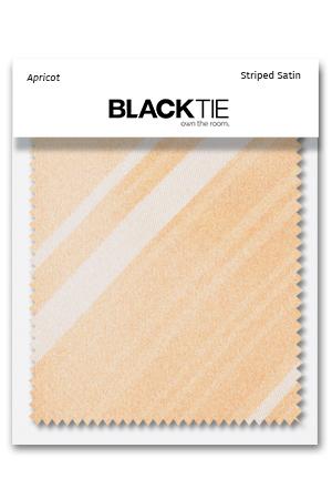
Orange Swatches
Orange spans a wide range of warm tones, and a fabric sample can make those differences easier to understand. Soft peach, pink-toned coral, earthy cinnamon and brighter tangerine do not create the same outfit. Choose a swatch that corresponds to the garment or accessory you are considering, then compare it with the actual materials around it. The Orange Formalwear guide helps connect your fabric choice with the finished pieces.
Compare the different warm undertones
Start by separating lighter, softer shades from deeper earth tones and brighter oranges. Peach and apricot may relate to a delicate palette, while coral can introduce more pink. Cinnamon and rust provide deeper warmth, and mandarin or tangerine creates another level of brightness. The actual samples will show distinctions that names alone cannot.
Place the fabric beside the shirt, dress material or jacket you need to coordinate. A shade can look different against white, ivory, navy or grey. Make the decision from those relationships instead of relying on a sample viewed alone against an unrelated background.
Choose the relevant accessory weave
Luxury Satin, Herringbone, Tapestry, Palermo, Venetian and Striped Satin are represented in various orange-family shades. A smooth surface may appear more reflective, while a woven texture can add detail without the same shine. Check the specific swatch description for the material and product relationship.
Use the corresponding sample when selecting orange vests, orange bow ties and orange neckties. Keep both the shade and range in your notes. Coral satin and coral herringbone may coordinate, but one does not prove an exact match with the other.
Review rust tailoring and patterned directions
Rust Metro fabric is a useful reference for the coordinating Metro Rust suit direction, while Rust Stretch is another material to assess by its own description. Before choosing orange men’s suits, confirm that the sample represents the exact garment range rather than simply another fabric called rust.
Orange Regal, Madison Plaid and Newton Stripe samples offer additional patterned directions. Use them alongside the finished product photographs, since a small sample may not show the entire repeat. A swatch helps with color and texture; a complete garment or accessory image helps with scale and overall appearance.
Test the palette under consistent lighting
Compare the samples in daylight and in indoor lighting relevant to the event. Warm colors can appear more yellow, red or muted as the surroundings change. Viewing the fabrics together under the same conditions is more useful than comparing memories of how they looked in different rooms.
A phone photograph can help communicate a general direction, but camera settings and screens may alter the shade. If an exact wedding match matters, retain the physical sample as the reference and share the precise product information. Do not assume that everyone sees the same coral or peach on their own device.
Decide what needs to match
A matching suit requires the appropriate coordinating cloth, while accessories can relate more loosely through color. A tie and square might share a small warm accent without using the same pattern. Decide which items need an exact relationship before trying to make every fabric in the outfit identical.
Explore orange pocket squares and orange cummerbunds after the main palette is settled. Keep the number of strong details proportionate to the outfit. A neutral shirt and restrained footwear can give the warm accessories enough space to be noticeable without making the combination feel crowded.
Move from comparison to the finished outfit
Read each swatch listing for its details and the material it represents. If the specific jacket or accessory fabric is not offered, another orange sample can suggest a general palette but cannot verify an exact match. Review the complete product information before choosing the final garments.
Confirm current availability and required sizes after settling the color direction, especially for a wedding party. Try the finished pieces together with time for any fit adjustments. The purpose of the swatch is to make the fabric decision more reliable, helping the final outfit look intentionally coordinated rather than assembled from similar shade names.