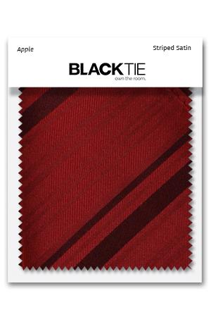
Red Swatches
Red can change dramatically across materials and lighting. A bright satin, a deep herringbone and a patterned jacket fabric may all belong to the same family while creating very different effects. This collection helps you compare those differences before coordinating an outfit or wedding party. Use the Red Formalwear hub alongside the samples to plan how your selected shade will appear across garments and accessories.
Start with the product you want to match
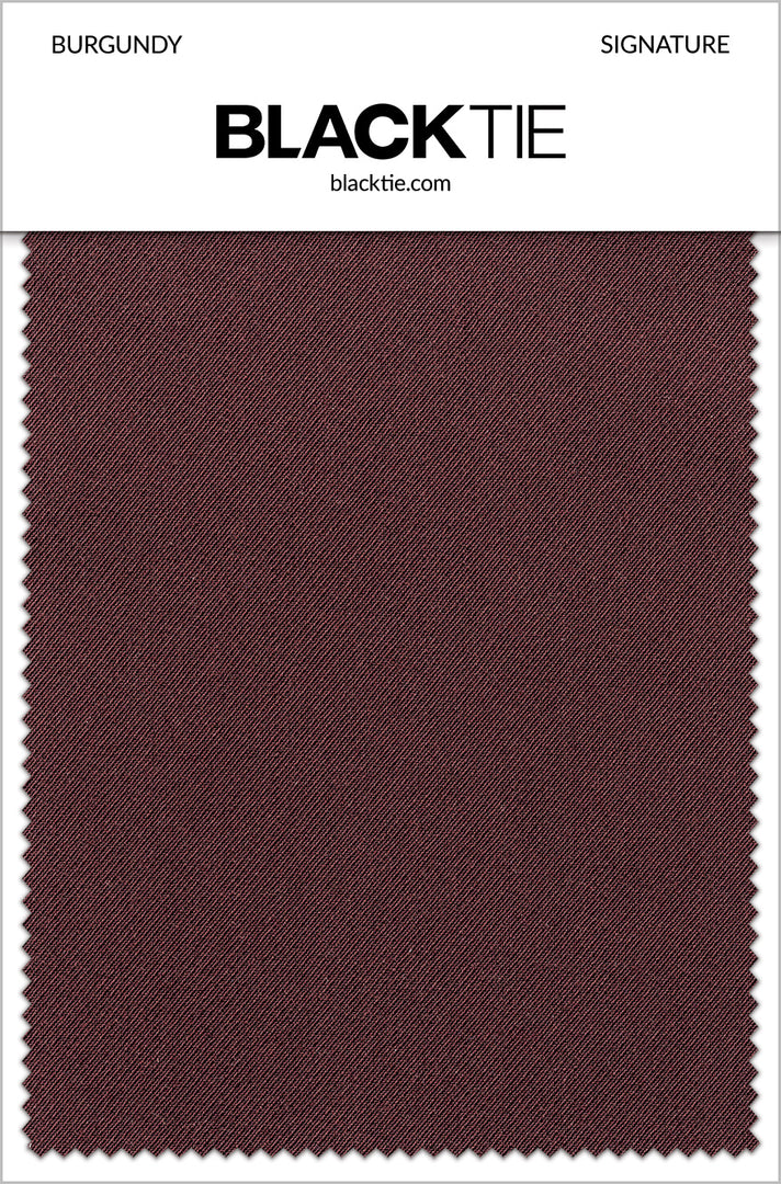
Choose the swatch that corresponds to the actual garment or accessory under consideration. Burgundy Signature, Burgundy Savoy and Burgundy Luxor are different product references, not interchangeable labels for one universal fabric. Read the sample description and compare it with the item you plan to purchase.
This is especially useful for wedding coordination, where several fabrics may need to work together. A sample can help establish a close-looking match or a deliberate contrast, but it should not be treated as a guarantee for unrelated products. Keep the fabric family and shade name together in your notes.
Explore red accessory materials
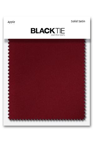
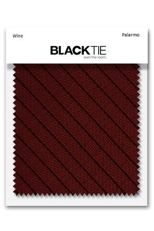
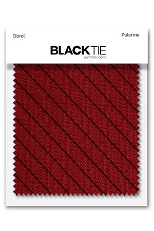
Available examples include Wine Luxury Satin, Apple Tapestry, Scarlet Luxury Satin, Merlot Herringbone and Claret Palermo. Other Venetian, Striped and woven designs provide additional ways to compare the palette. Look at how the surface reflects light as well as how deep or bright the red appears.
Use these samples while considering red bow ties, red neckties and red pocket squares. If you want closely coordinated accessories, confirm that each item is offered in the same fabric family. A matching shade name alone may leave differences in texture or sheen.
Compare tailoring and patterned jacket swatches
Burgundy Savoy, Burgundy Luxor, Burgundy Austin Diamond and Apple Red Aries are among the available examples associated with tailoring or jacket designs. The sample helps you judge the material, while the product photographs show how it appears across a larger garment. Both are useful when a pattern is involved.
Browse red men’s suits and red tuxedo jackets with the specific sample in mind. A small fabric piece may show only part of a pattern, so review the complete jacket image before deciding on its visual impact. Check current product details and sizes separately from the swatch selection.
Compare under realistic lighting
View the samples in daylight and under indoor lighting similar to the event setting. Reds may appear brighter, darker or warmer as the light changes. Put the sample beside the actual shirt, dress or other fabric you want to coordinate instead of judging it only against a neutral tabletop.
A phone photograph can be useful for sharing a general idea, but it is not a reliable final color reference. Screens and cameras can alter red saturation and depth. For reflective materials, change the angle as well as the lighting so you understand how highlights affect the apparent shade.
Build a manageable wedding palette
Start with the key fabric already chosen for the event, then compare a shortlist of reds. Decide whether the aim is close matching, a range of related tones or a complementary accent. Label each sample clearly so everyone discussing the palette can identify the same material and shade.
A red vest or red cummerbund creates a larger color area than a pocket square, so judge the sample in relation to how the finished item will be worn. You may prefer one consistent accessory color across the group rather than trying to match every visible element.
Use the sample as one part of the decision
A fabric swatch does not determine garment fit, availability or every construction detail. Review each finished product’s listing for included pieces, sizes and care information. The sample is most useful for understanding color and material, while the full product information answers the other questions needed before ordering.
Keep the chosen sample and its identifying details until the outfit is assembled. Compare the actual pieces when they arrive and try them together before the event. Combining fabric comparison with a complete outfit review gives you a more dependable red color plan than selecting several items from screen images alone.
Questions to Settle Before Ordering
For red, decide whether brightness or depth is the main goal. Scarlet and darker wine-like tones create different impressions beside the same neutral outfit. A controlled contrast can be more effective than repeating several reds that almost, but do not quite, match.
How many samples should I compare at once? Begin with a focused shortlist based on the products you are genuinely considering. Too many near-identical options can make the decision harder without adding useful information. Place the key event fabric beside the samples and identify which relationships work best, then narrow the group. Keep each sample attached to its identifying information so a preferred shade is not separated from the fabric range and product it actually represents.
What should I share with others choosing the outfit? Share the exact sample name and associated product information, not only a photograph or a general color description. If possible, let the person making the final color decision compare the physical materials together. A photograph can document the plan but may not reproduce the shade accurately on another screen. Record whether the intention is close matching or a complementary palette, since those goals can lead to different but equally deliberate selections.
What does a sample not tell me? A sample does not show how every size will fit, guarantee current product availability or establish all details of a finished garment. It may also show only a small portion of a repeating pattern. Use the full product photographs and descriptions for those questions, and confirm the exact item before ordering. Keep the sample for comparison when the finished pieces arrive, while recognizing that its main purpose is to support an informed material and color choice.