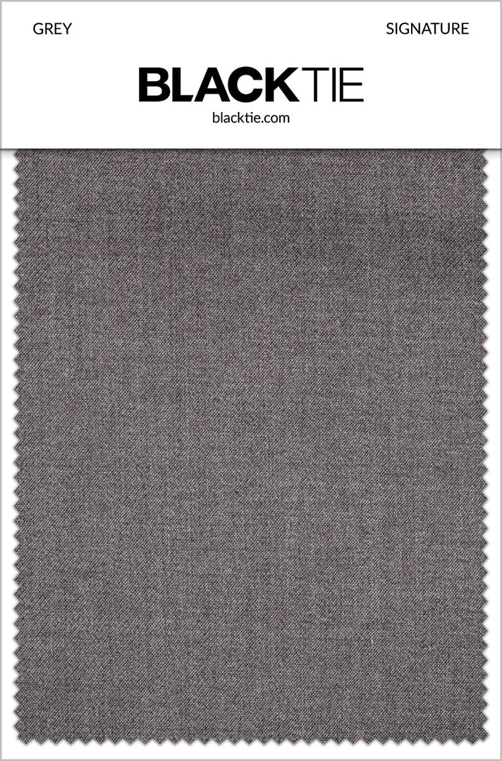
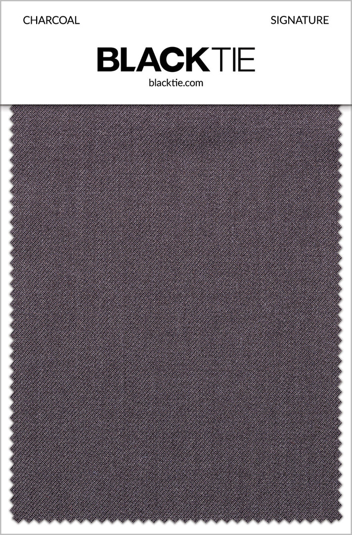
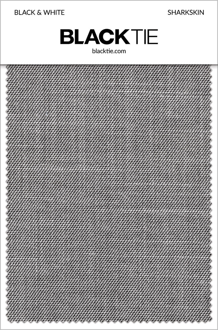
Grey Swatches
Grey is a broad family, and small differences can matter when several pieces need to work together. A fabric swatch lets you compare an actual material with your shirt, suit or wedding colors instead of relying entirely on a screen. This collection includes tailoring and accessory fabrics, so select the swatch that corresponds to the item you are considering. The Grey Formalwear hub provides a starting point for the wider outfit.
Compare the depth and undertone of grey
Light grey, medium grey and charcoal create different levels of contrast. Silver, platinum and pewter can add further variation, particularly when a fabric reflects light. Place samples beside the other materials you plan to use and observe whether the combination feels cool, warm, light or dark overall.
View the swatches in daylight and in indoor lighting. A grey that appears neutral in one room can look slightly blue or brown elsewhere. This does not make the sample unreliable; it helps you understand how the cloth will behave in the settings where the outfit is likely to be worn.
Select the actual tailoring fabric
The collection includes Grey and Charcoal Signature, Black & White Sharkskin, Vintage Grey Stretch, and several Metro and Savoy greys. These are separate fabric choices rather than interchangeable versions of one universal grey. Check the product description to confirm which garment or range the sample represents.
When planning grey men’s suits and grey vests, compare coordinating pieces by collection as well as shade. A sample from a different range may help establish a general palette, but it cannot confirm that two garments will form a matching suit.
Evaluate patterned evening fabrics
For a more expressive outfit, the swatch selection includes directions such as Black & Silver Savannah, Dark Grey Floral Fusion and Silver Night Vine. Aries patterns bring combinations including White & Silver, Silver & Black, Platinum and Granite. Examine both the pattern and the background color before deciding how to style the jacket.
A small sample may show only part of a large design, so use it alongside the full garment photographs. Browse grey tuxedos to see how a pattern appears across a jacket. The swatch helps with texture and color, while the product images help with the overall scale and placement.
Coordinate accessory fabrics accurately
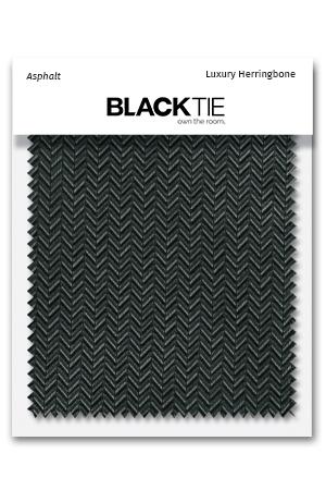
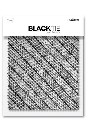
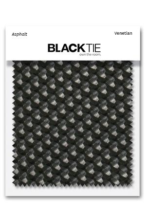
Grey-family Satin, Tapestry, Herringbone, Venetian, Palermo and striped fabrics offer different ways to build a coordinated palette. A satin sample may appear more reflective than a textured weave in the same named shade. Keep the fabric family in your notes when comparing silver, charcoal, platinum or pewter.
Use the appropriate sample when choosing grey bow ties, grey neckties or grey pocket squares. Matching a color word alone is not enough when the goal is an exact visual pairing. For a looser coordinated look, a clear difference in texture can be part of the design.
Make a practical wedding color comparison
Place the sample beside the actual shirt, dress fabric, flowers reference or other material you are coordinating. Compare the pieces together rather than viewing each separately from memory. A neutral grey can support many accent colors, but the best combination depends on their relative depth and finish.
For a wedding party, label the chosen fabric and share the exact product reference. That reduces the risk of several people ordering different interpretations of silver or charcoal. A phone photograph can help communicate the general direction, but it may not reproduce the sample's true appearance on someone else's screen.
Use swatches as one part of the decision
Check the listing for sample details and the material it represents. A swatch helps you judge fabric, but it does not demonstrate garment fit, construction or the complete pattern layout. Review the corresponding clothing page and its size information before placing the final order.
Once the palette is settled, check current garment and accessory availability and try the complete outfit with time to address fit. Keep the swatch as a reference when selecting the remaining details. A careful comparison early in the process can make the later choices simpler and help the final grey outfit look intentionally coordinated.
Questions to Settle Before Ordering
For grey, compare both depth and undertone. A cooler grey may look different beside a warmer neutral even when the two appear similar on separate screens. Bring the actual fabrics together before deciding whether the combination should match closely or contrast.
How many samples should I compare at once? Begin with a focused shortlist based on the products you are genuinely considering. Too many near-identical options can make the decision harder without adding useful information. Place the key event fabric beside the samples and identify which relationships work best, then narrow the group. Keep each sample attached to its identifying information so a preferred shade is not separated from the fabric range and product it actually represents.
What should I share with others choosing the outfit? Share the exact sample name and associated product information, not only a photograph or a general color description. If possible, let the person making the final color decision compare the physical materials together. A photograph can document the plan but may not reproduce the shade accurately on another screen. Record whether the intention is close matching or a complementary palette, since those goals can lead to different but equally deliberate selections.
What does a sample not tell me? A sample does not show how every size will fit, guarantee current product availability or establish all details of a finished garment. It may also show only a small portion of a repeating pattern. Use the full product photographs and descriptions for those questions, and confirm the exact item before ordering. Keep the sample for comparison when the finished pieces arrive, while recognizing that its main purpose is to support an informed material and color choice.